~ Kansai Nerolac presents vibrant, bright and playful hues to brighten up your home this Spring – Summer 2016~
~ Spring – the season of renewal is the perfect time to brighten up your home interiors with colours from Kansai Nerolac’s Spring – Summer palette 2016 ~
~ Colour Alert trend-setters, Kansai Nerolac’s Spring Summer Palette is here ~
Spring is all about new life. Flowers bloom the weather gets warmer and a general feeling of freshness takes hold. It’s time liven up your home and welcome spring indoors!
Capture the breezy, casual spirit of this season with the help of Kansai Nerolac Healthy Home Paints range to create a fresh, vibrant space for your family. Read on to find out which colours will storm the home décor space this spring -summer.
- Yellow- The symbol of all things bright and joyful
Traits: Happy, Hopeful
For home interiors use a palette with lighter yellows to inspire feelings of welcoming warmth and comfort. To add an energetic vibe to your living room or children’s play area use bright yellow as an accent colour.
For home exteriors, combine bright yellows with bright blues and greens for a trendy Mediterranean themed finish.
Yellows for this season: Light Tulip 2008; Tulip Yellow 2020; Banana Cream 2010; Bumble Bee 2014; Wax Yellow 2015; Daffodil 2031; Mustard 2698; Gold Brass 4029
- Red – Pulsating with energy and life
Traits: Energetic, Free spirited
Even when used sparingly red dominates a room, catching ones eye almost effortlessly. Use combinations of neutral shades like white and grey to further highlight the red in your home interiors.
These muted palettes also exude a calm refined appeal, preventing it from seeming overbearing. This is especially important when planning palettes for bedrooms and children’s study areas so they do not appear distracting. Keeping the 60-30-10 palette colour selection in mind will help plan this better.
You may choose to use red accessories like cushions and throws in addition to wall accents. Another great option is to have a red designer finish wall. This can alter the complete character of a room without having to redo the entire space!
Experimentation is the key to make home exteriors stand out with red. Here one can let loose a riot of colours to give your home exteriors a bright folk themed finish.
Reds for this season: Strawberry Cream 4103; Adventure 2189; Coraline 2154; Salsa Pink 4124; Wild Rose 2181; Tempo 2249; Berry Jam 2237; Kokam Red 4108; Desert Adobe2175
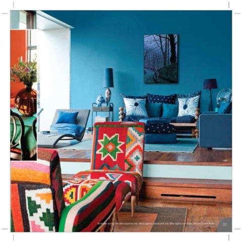
- Blue – A paradox of vibrant calm!
Traits: Calm, Relaxing, Unexpected
Clear blue skies are the inspiration for many an artist and serene cool blues are like a balm for the soul in summers. Whichever mood you choose to recreate in your home, blue will always be a winner. This season we recommend trying some offbeat shades of blue for a refined arty finish. Combine these with printed upholstery to complete the offbeat look.
Pale blues combined with accessories in neutral shades will highlight textures, creating calming effect.
For slightly more kitschy and layered interior décor, combine darker blues with bright prints and accessories. These rooms are simultaneously relaxing and visually interesting and suit studio apartments and spaces that double up as living and working areas.
Blues for this season: Iced chiffon 2464; Cloudless sky 4304; Surfers paradise 4307: French Drapes 4296; Aqua Crystal 2471; Lakeside Waters 4315; Blue Crackle 2441; Streamline 2440; Mali Opal 4242; Deep turquoise 4310; Powder blue 6550; Le Mer 2476; Danube Sky 4262;
- Green: Bringing the gardens indoors
Traits: Earthy, prosperous, rejuvenating
A colour for spring, green seamlessly fits into almost any palette. Combine dark greens with bright colours like yellow for vibrant home exteriors.
Interiors may be done up with light whimsical greens and neutral palettes to create serene harmonious zones. Vibrant sea greens and textured green walls will add a rich exhuberant appeal to living spaces.
Muted greens are an integral part of springtime colour palettes when you want to use your walls as a backdrop for floral prints and accessories. Alternately designer finish green walls can add a touch of vibrancy that minimizes the need for accessories.
Greens for this season: Chartreuse2642; Mountain green 2523; Envirogreen 4567; Bombay Green 4362; Eurasia 2510 Zebulon 2496; Dark olives 4435;
- Wild Berries 4062 – Inherently Indian
Traits: Friendly, warm
A colour for every season Wild Berries inspired by the ‘bor’ an Indian summer fruit. This shade lends itself seamlessly various palettes blending in to add a discerning, earthy connect in almost any setting.
On one hand Wild Berries has the power to add a pop of colour to muted interior spaces and on the other hand it works well as a backdrop for brighter shades and textured finishes. Native to India it is seen from the red soil of the Western Ghats, to traditional Indian pottery and the sloping roofs of South India.
About Kansai Nerolac Paints Ltd:
With a rich heritage of over 90 years in the paint industry, Kansai Nerolac Paints is one of the largest paint companies in India and the leader in industrial segment. A wholly owned subsidiary of Kansai Paints, the sixth largest paint company worldwide, Kansai Nerolac manufactures a diversified range of products ranging from decorative paint coatings for homes, offices, hospitals and hotels to sophisticated industrial coatings for industries.
Kansai Nerolac has established itself as a leader in product innovation with its recent product launches of Impression Eco-clean (the Eco-friendly range of paint with low VOC and no added lead) & Impressions 24 Carat (High Definition paint with the technology of Micro Embedded Brightness Boosters – MEBB). Through its product portfolio and customer awareness campaigns to promote environmental sensitivity, KNPL is trying in its own way to gift a sustainable future.www.nerolac.com